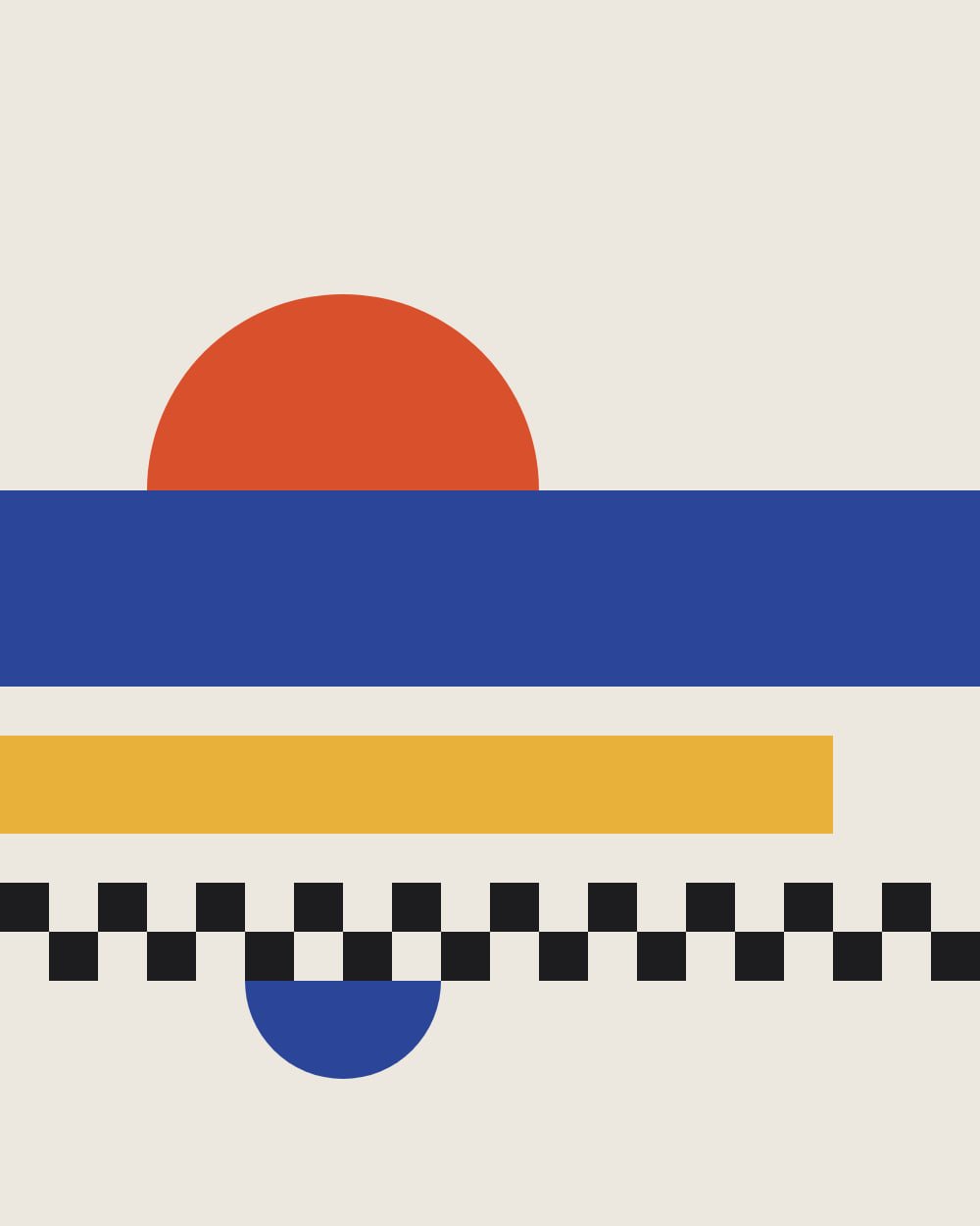
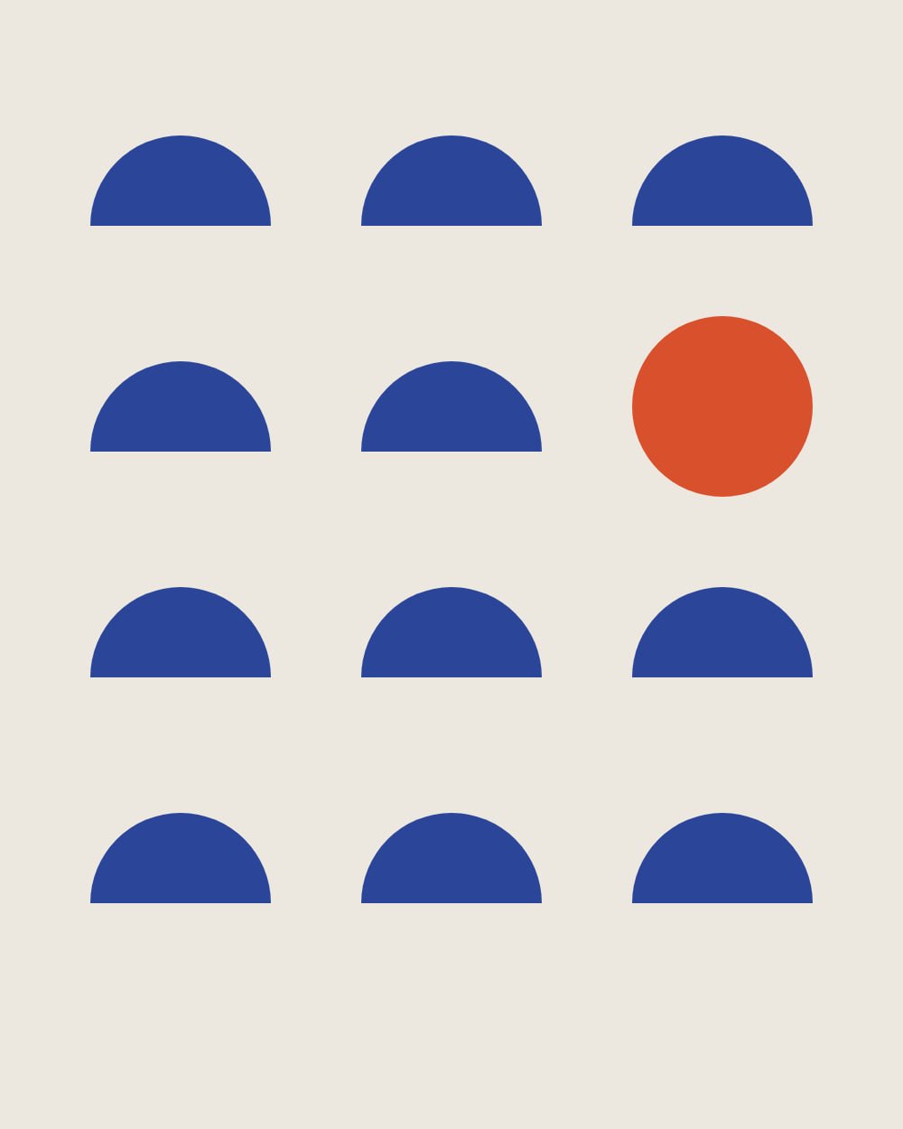


Neue Geometry 90/100
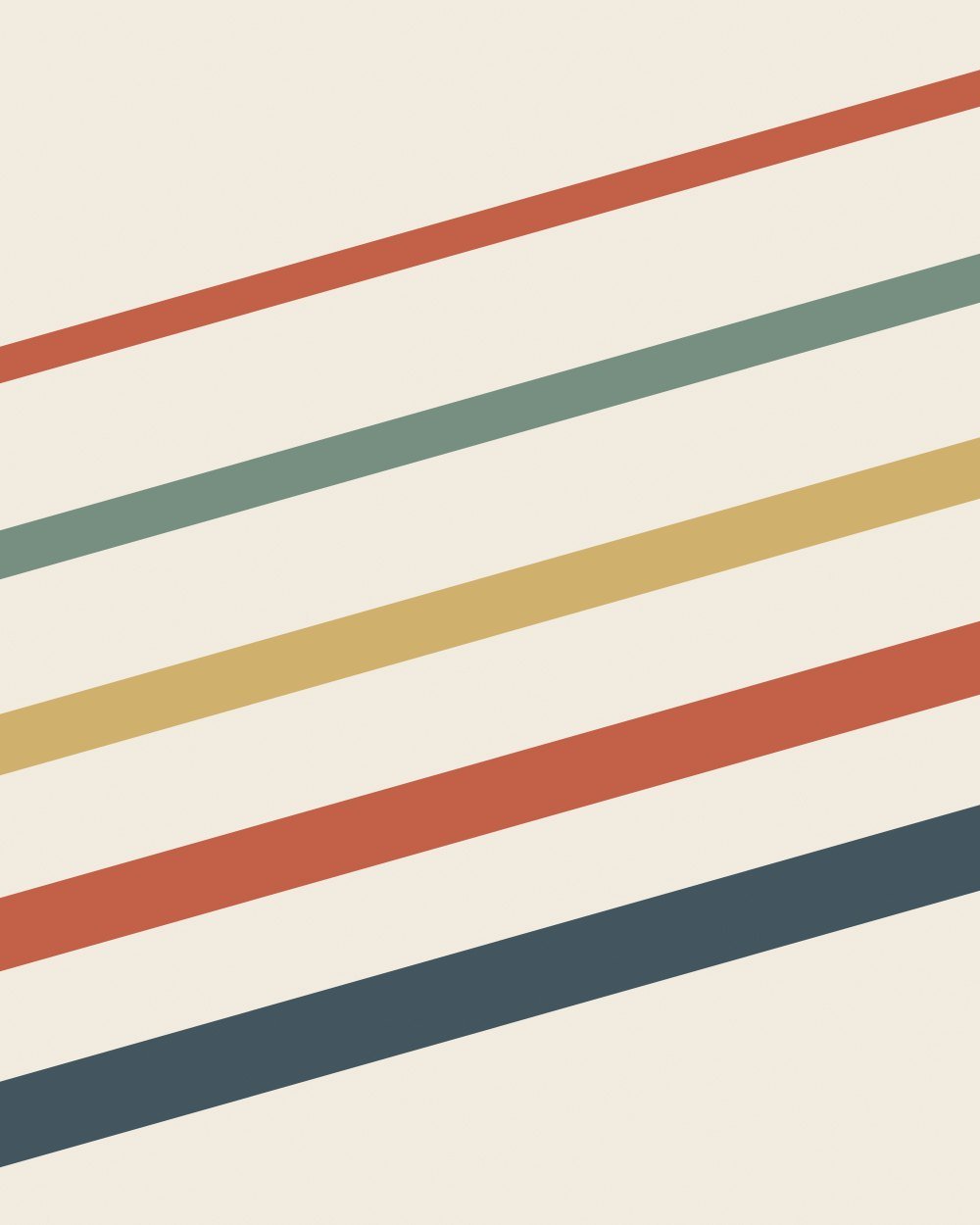
Bauhaus-inspired geometry for coworking, education and tech offices.
- Enough color to give a neutral wall a focal point
- Warm undertones match the wall
Art for white subway tile
Glossy white tile is bright, hard-wearing and reflective, and its grout lines draw a strong grid. Art on tile has to handle glare and hold its own against that grid.
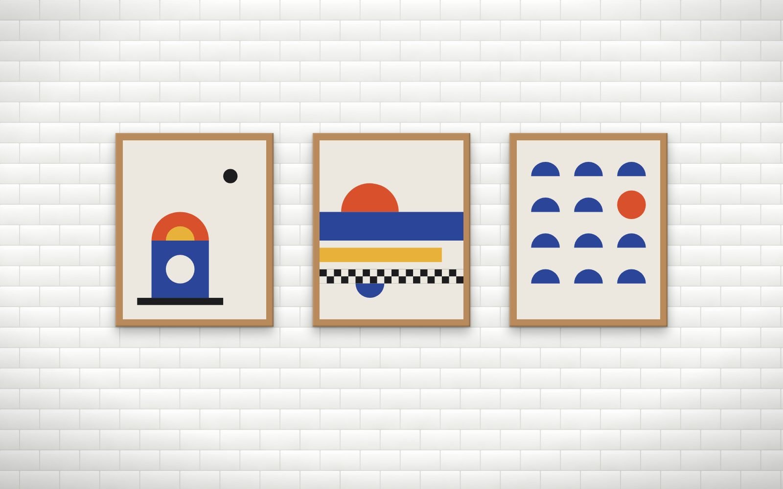
Ranked from the measured colors of every print against a white subway tile wall (#EFEFEC). Score your exact paint color or try a photo of your wall.
Bauhaus-inspired geometry for coworking, education and tech offices.
Modern botanical studies for wellness studios and clinics.
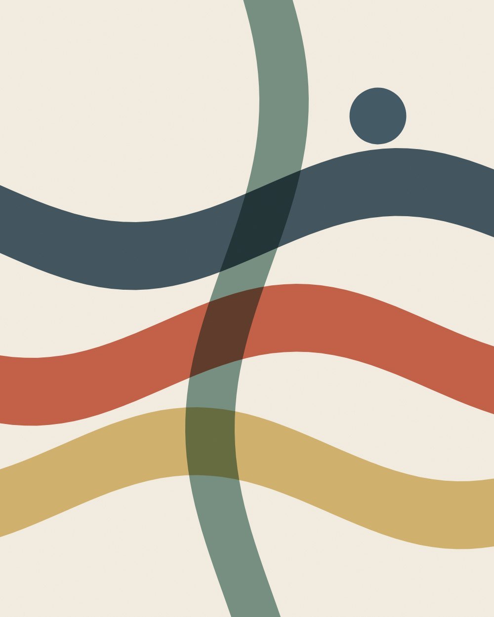
Layered translucent bands in navy, clay, ochre and sage for restaurants, hotels and lounges.
Warm organic abstracts for cafes, restaurants and hospitality floors.
Cafes and coffee shops · Restaurants · Bars and lounges · Salons and spas · Dental and medical clinics. Each venue page covers counts, sizes and hanging heights for that kind of room.
Yes, with a diamond or tile bit at low speed and tape over the spot, ideally through a grout line, which is easier to patch later.
Prints behind acrylic in a sealed frame handle humidity well. Keep them away from direct steam above sinks, kettles and dishwashers.
Every print was measured, not tagged: its colors were clustered in CIE Lab space and compared with the wall using CIEDE2000, the color-difference formula print shops use. Each bundle gets three scores. Presence: does the print stand out from this wall at a glance. Harmony: do its accent hues complement or echo the wall. Undertone: do warm and cool undertones agree. The overall match weights them 40, 35 and 25.
Exposed brick Painted white brick Concrete Light wood slats Dark wood paneling Bright white Warm white Greige Light gray Charcoal Black Navy Sage green Forest green Terracotta Blush pink Pale blue