Art for greige

Art for greige walls

Greige, the gray-beige on more rental and commercial walls than any other color, is a light neutral with a warm undertone. It is forgiving, but low-contrast art sinks into it.

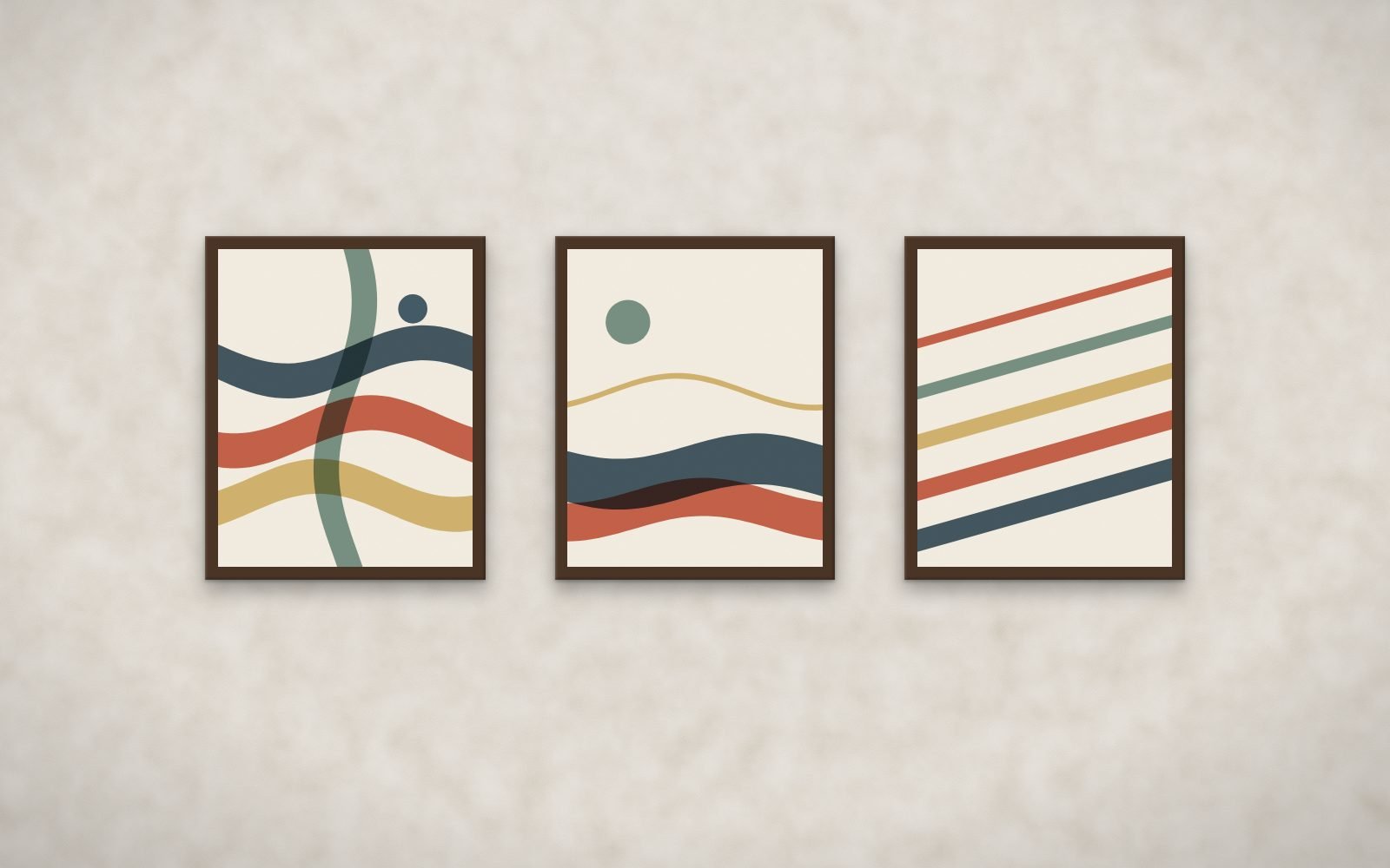
Ribbon Weave prints in walnut frames on greige walls
Top match on greige: Ribbon Weave, framed in walnut. Rendered from the actual prints.

Best bundles for greige walls

Ranked from the measured colors of every print against a greige wall (#CDC4B6). Score your exact paint color or try a photo of your wall.

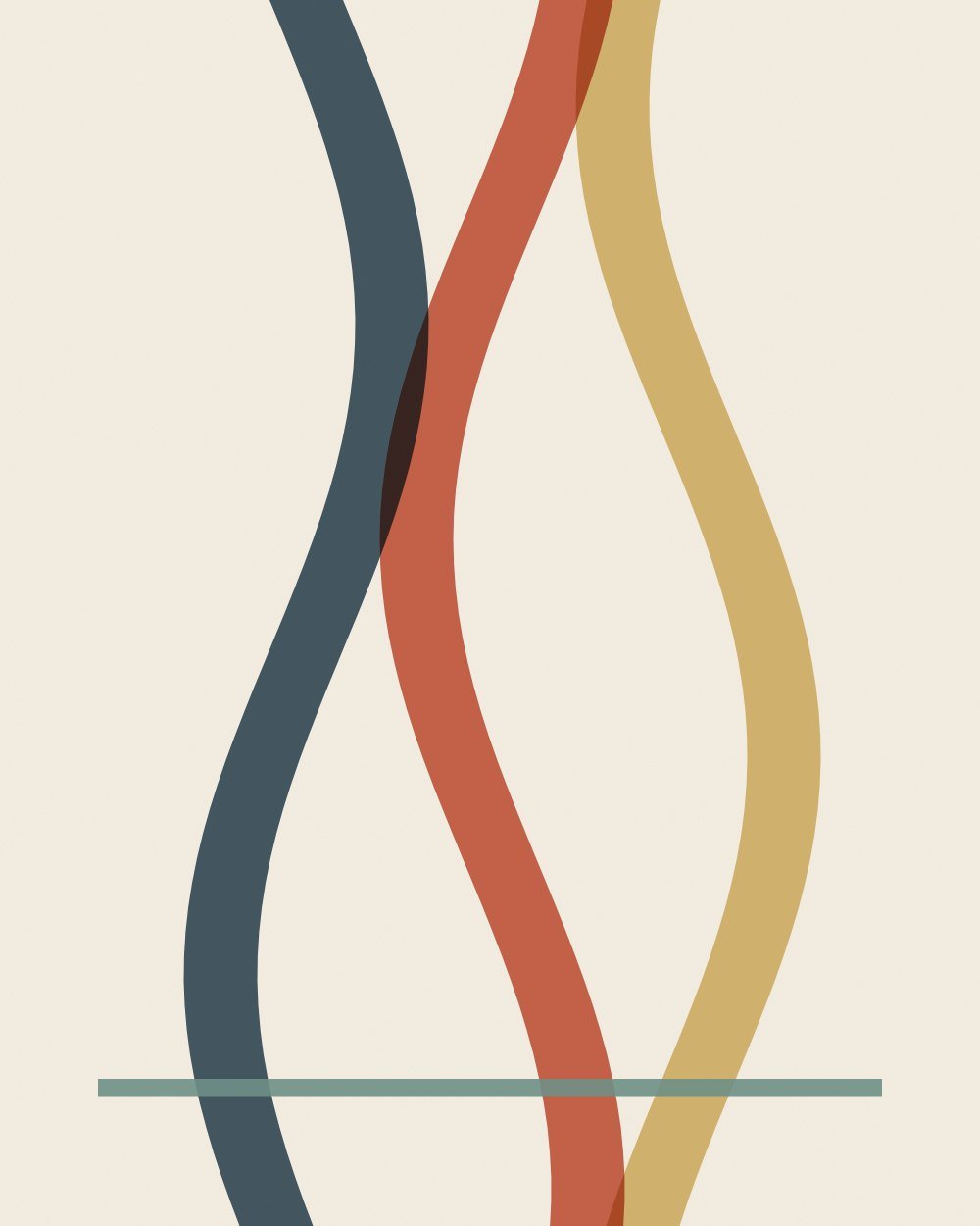
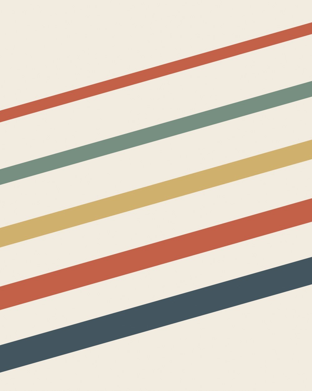
Ribbon Weave 99/100

Layered translucent bands in navy, clay, ochre and sage for restaurants, hotels and lounges.

  • Strong color carries the prints against the wall
  • A tonal accent ties the prints to the ochre wall
  • Enough color to give a neutral wall a focal point
Presence
100
Harmony
100
Undertone
96

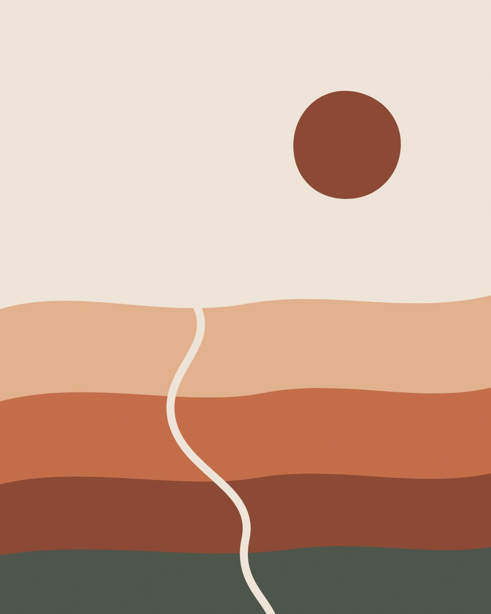
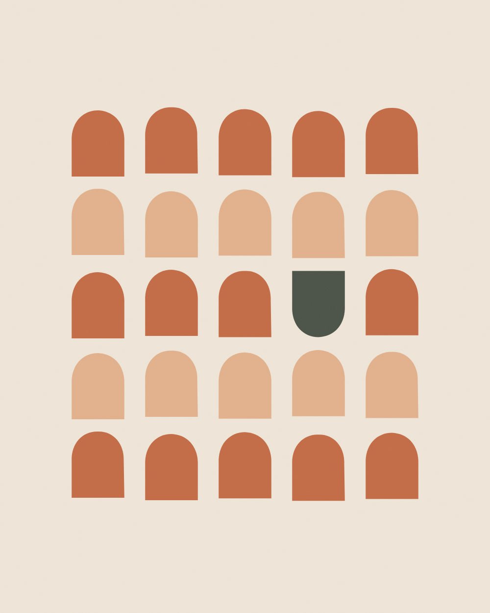
Terra Forms 94/100

Warm organic abstracts for cafes, restaurants and hospitality floors.

  • Strong color carries the prints against the wall
  • A tonal accent ties the prints to the ochre wall
  • Enough color to give a neutral wall a focal point
Presence
100
Harmony
100
Undertone
76

Studio Botanica 93/100

Modern botanical studies for wellness studios and clinics.

  • Strong color carries the prints against the wall
  • A tonal accent ties the prints to the ochre wall
  • Warm undertones match the wall
Presence
100
Harmony
92
Undertone
85

Paper Cuts 93/100

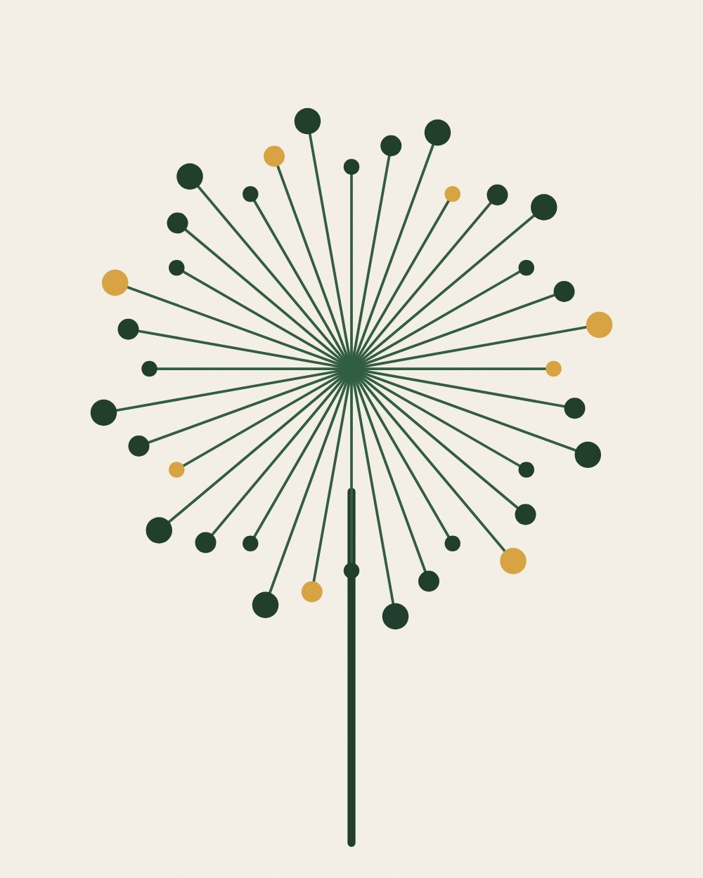
Single botanical silhouettes in deep green on warm white, for spas, clinics and rentals.

  • Strong color carries the prints against the wall
  • A tonal accent ties the prints to the ochre wall
  • Warm undertones match the wall
Presence
100
Harmony
92
Undertone
85

Framing, light and size on greige

Where you find greige walls

Offices · Hotels and boutique hospitality · Dental and medical clinics · Short-term rentals and vacation homes · Senior living communities · Salons and spas. Each venue page covers counts, sizes and hanging heights for that kind of room.

Questions about art on greige

What color art goes with greige walls?

Art with a ground lighter or darker than the wall and warm accents such as terracotta, ochre, olive or navy.

Is greige too plain for a business?

It is a good backdrop. The art supplies the identity, which is why greige rooms gain the most from a strong set of prints.

How the ranking works

Every print was measured, not tagged: its colors were clustered in CIE Lab space and compared with the wall using CIEDE2000, the color-difference formula print shops use. Each bundle gets three scores. Presence: does the print stand out from this wall at a glance. Harmony: do its accent hues complement or echo the wall. Undertone: do warm and cool undertones agree. The overall match weights them 40, 35 and 25.

Other wall finishes

See it on your own wall first.

Open the wall visualizer