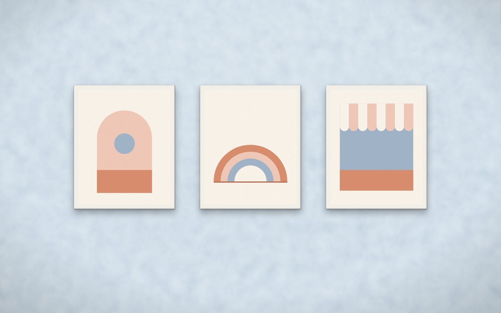
Pale blues are fresh and calm, common in clinics, rentals and coastal rooms. Warm accents such as sand, coral and terracotta keep them from feeling cold.
Top match on pale blue: Sunroom, framed in white. Rendered from the actual prints.
Prints with coral, terracotta, sand or ochre accents on a light ground. They are the warm opposites of blue.
Is blue a good color for a waiting room?
Pale blue reads calm. Pair it with warm art so the room does not feel cold.
How the ranking works
Every print was measured, not tagged: its colors were clustered in CIE Lab space and compared with the wall using CIEDE2000, the color-difference formula print shops use. Each bundle gets three scores. Presence: does the print stand out from this wall at a glance. Harmony: do its accent hues complement or echo the wall. Undertone: do warm and cool undertones agree. The overall match weights them 40, 35 and 25.